Zello Android History Redesign

Zello Android History Redesign

Zello Android History Redesign

Redesigned Zello’s Android History to modernize the UI and unify experiences across platforms.

Project Overview

Zello’s Android History screen hadn’t seen a major update since 2012. Over time, visual inconsistencies, unclear message types, and fragmented user flows across Android and iOS made the experience confusing for users — and increasingly complex for engineers to maintain.

Zello’s Android History screen hadn’t seen a major update since 2012. Over time, visual inconsistencies, unclear message types, and fragmented user flows across Android and iOS made the experience confusing for users — and increasingly complex for engineers to maintain.

Timeline

3 weeks (Sep 2024)

3 weeks (Sep 2024)

3 weeks (Sep 2024)

Team

1 Product Designer

1 Product Designer

1 Product Designer

2 Engineers

2 Engineers

2 Engineers

1 PM

1 PM

1 PM

1 Design Manager

1 Design Manager

1 Design Manager

Role

Product Designer

Product Designer

Product Designer

Platform

Android

Android

Android

Problem context

Outdated Android history screens made it difficult for users to navigate conversations, leading to confusion, inconsistent experiences across platforms, and added strain on engineering teams.

Outdated Android history screens made it difficult for users to navigate conversations, leading to confusion, inconsistent experiences across platforms, and added strain on engineering teams.

Outdated Android history screens made it difficult for users to navigate conversations, leading to confusion, inconsistent experiences across platforms, and added strain on engineering teams.

Users struggled to distinguish different types of messages, and the inconsistencies between Android and iOS disrupted the brand experience and created inefficiencies for future development.

Above: Visual discrepancies between Android and iOS history screens

Above: Visual discrepancies between Android and iOS history screens

Above: Visual discrepancies between Android and iOS history screens

Outdated Design

Cluttered layouts and outdated visuals made it harder for users to scan and find important messages quickly.

Cluttered layouts and outdated visuals made it harder for users to scan and find important messages quickly.

Platform Inconsistency

Android and iOS handled history differently, creating confusion and extra work for the engineering and design team.

Android and iOS handled history differently, creating confusion and extra work for the engineering and design team.

Message Confusion

Users struggled to distinguish between audio, text, images, and emergency alerts, leading to communication delays.

Users struggled to distinguish between audio, text, images, and emergency alerts, leading to communication delays.

Core challenge

How might we redesign Zello’s Android History screen to make message types easier to understand, modernize the visual experience, and align design systems across platforms without overwhelming existing users?

How might we redesign Zello’s Android History screen to make message types easier to understand, modernize the visual experience, and align design systems across platforms without overwhelming existing users?

How might we redesign Zello’s Android History screen to make message types easier to understand, modernize the visual experience, and align design systems across platforms without overwhelming existing users?

Research & analysis

Since Android History hadn't been deeply updated since the original app launch, I needed to ground the redesign in both internal patterns and external best practices.

Since Android History hadn't been deeply updated since the original app launch, I needed to ground the redesign in both internal patterns and external best practices.

Since Android History hadn't been deeply updated since the original app launch, I needed to ground the redesign in both internal patterns and external best practices.

I conducted an internal audit, competitive benchmarking, and reviewed Android design standards to inform the solution.

I conducted an internal audit, competitive benchmarking, and reviewed Android design standards to inform the solution.

I conducted an internal audit, competitive benchmarking, and reviewed Android design standards to inform the solution.

Visual Clarity

Use clean layouts and clear message types to help users scan conversations quickly.

Use clean layouts and clear message types to help users scan conversations quickly.

Logical Grouping

Group consecutive messages logically to reduce cognitive load and scrolling fatigue.

Group consecutive messages logically to reduce cognitive load and scrolling fatigue.

Scalable System

Create flexible components that adjust to different media and screen sizes.

Create flexible components that adjust to different media and screen sizes.

Touch Targets

Ensure buttons and actions meet Android’s minimum accessibility tap areas.

Ensure buttons and actions meet Android’s minimum accessibility tap areas.

Platform Alignment

Standardize key elements across Android and iOS without losing native feel.

Standardize key elements across Android and iOS without losing native feel.

Ideation

After identifying the key principles from research, I mapped the current Android History experience end-to-end.

After identifying the key principles from research, I mapped the current Android History experience end-to-end.

After identifying the key principles from research, I mapped the current Android History experience end-to-end.

This helped uncover hidden complexity, inform component needs, and prioritize areas for redesign.

This helped uncover hidden complexity, inform component needs, and prioritize areas for redesign.

This helped uncover hidden complexity, inform component needs, and prioritize areas for redesign.

Ideation & exploration
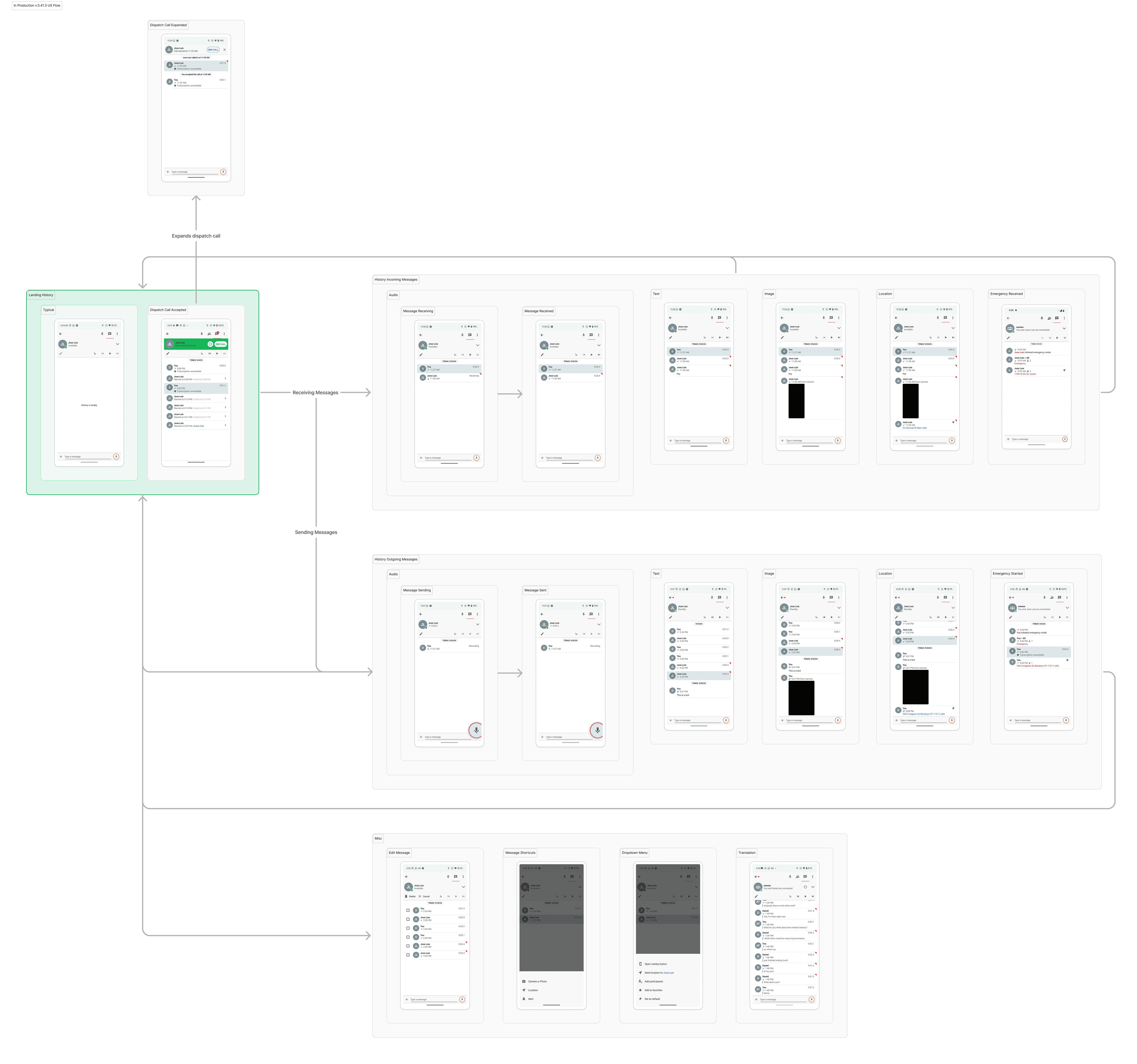
Designing a cleaner, scalable history system required stripping out legacy UI, defining grouping behavior, and creating adaptable components from scratch.

Designing a cleaner, scalable history system required stripping out legacy UI, defining grouping behavior, and creating adaptable components from scratch.

Designing a cleaner, scalable history system required stripping out legacy UI, defining grouping behavior, and creating adaptable components from scratch.

To prepare for a complete redesign, I audited every detail of the existing experience and made a series of foundational design decisions—from simplifying the layout and grouping logic to building new components for message types and optimizing media display across devices.

To prepare for a complete redesign, I audited every detail of the existing experience and made a series of foundational design decisions—from simplifying the layout and grouping logic to building new components for message types and optimizing media display across devices.

To prepare for a complete redesign, I audited every detail of the existing experience and made a series of foundational design decisions—from simplifying the layout and grouping logic to building new components for message types and optimizing media display across devices.

Final solution

The final redesign introduced a flexible, modern history system built for clarity, scalability, and platform alignment.

The final redesign introduced a flexible, modern history system built for clarity, scalability, and platform alignment.

The final redesign introduced a flexible, modern history system built for clarity, scalability, and platform alignment.

Every screen and component was carefully designed to handle different message types, device sizes, and user needs.

Overview

A quick look at how key design decisions came together to create a more scalable, intuitive Android history screen.

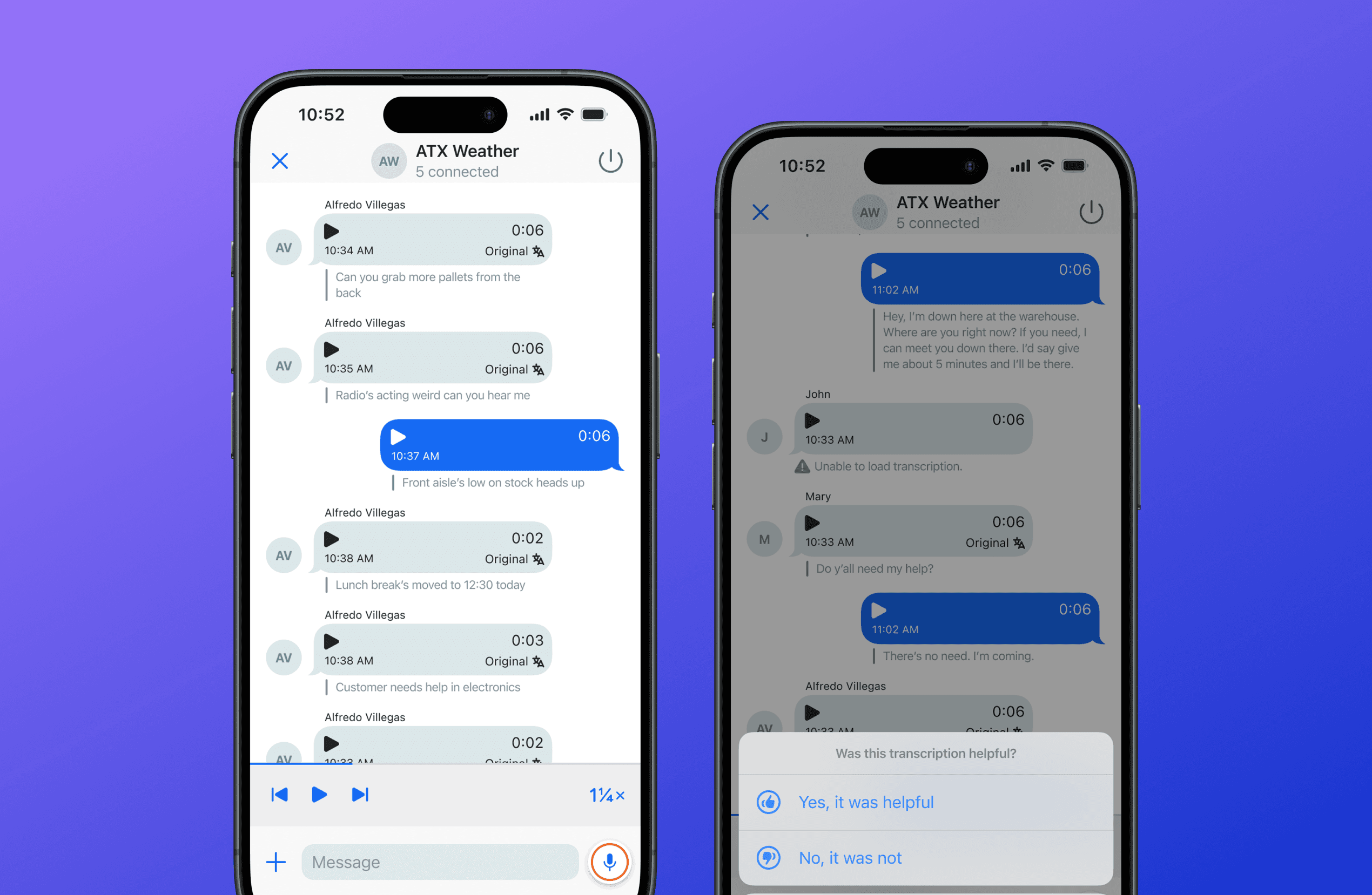
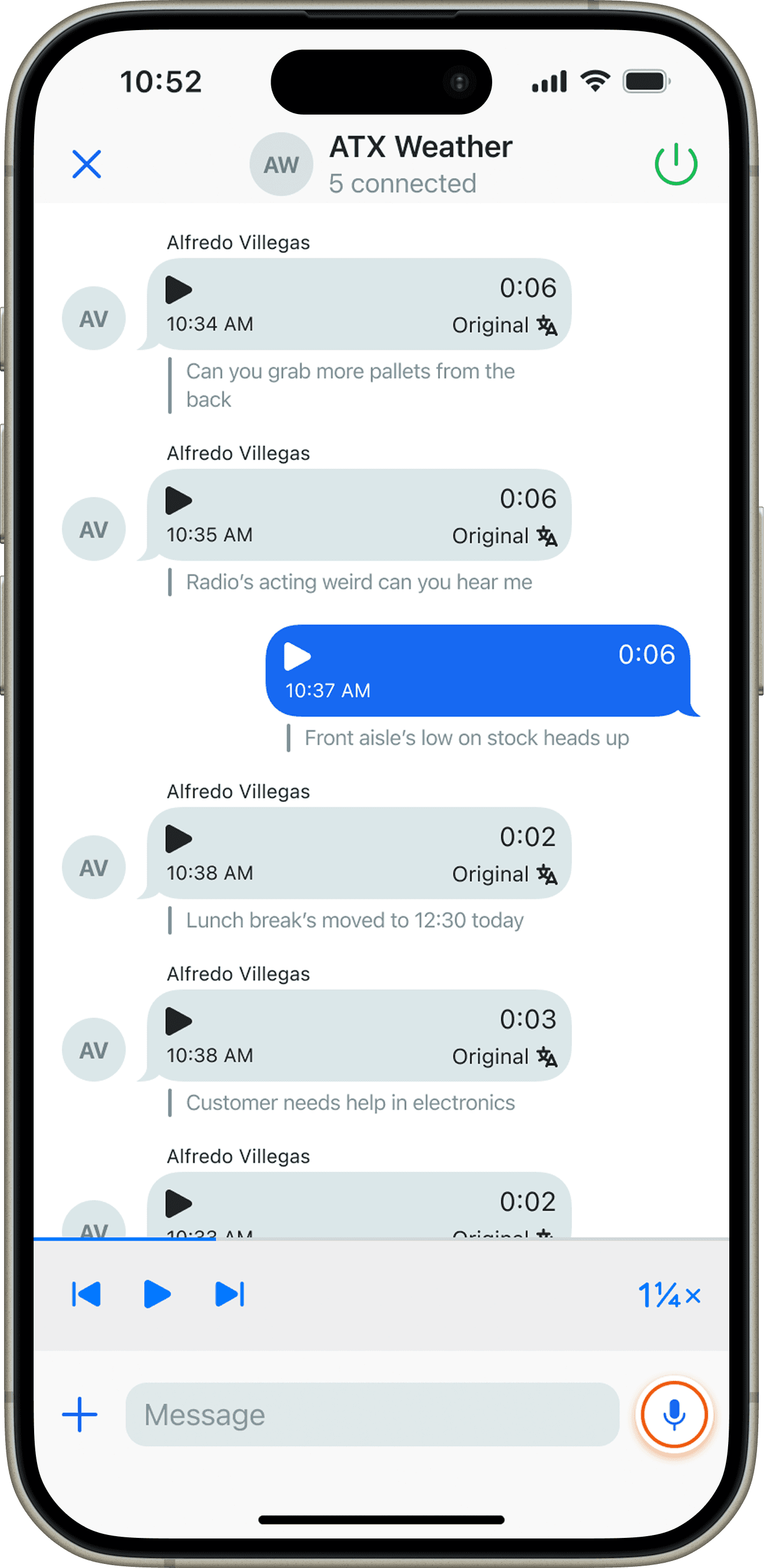
Persistent Timestamp

Instead of appearing as separate “bubbles,” timestamps now behave as sticky headers — improving scannability during fast navigation.

Note: Mirrors iOS behavior to give users better time context without disrupting the flow.

Mobile Dispatch Integration

Mobile Dispatch now leverages the same updated message bubble system and layout from the new History screen.

Note: Dispatch messages are styled differently but stay visually integrated with conversations.
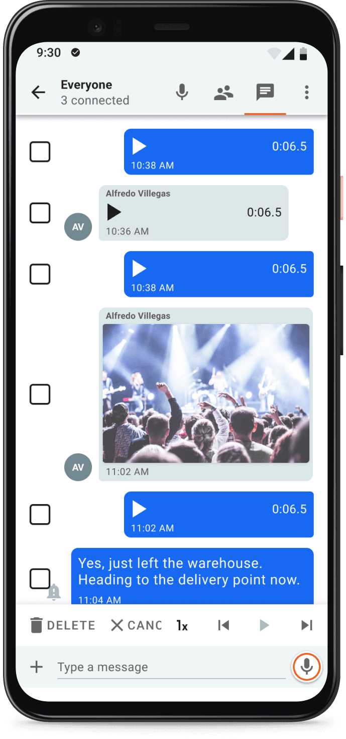
Multi-Delete Flow

Bulk message management was redesigned for speed and clarity. The updated multi-select interaction allows users to easily select and delete multiple messages without losing their place in the conversation.

Testing & impact

After finalizing designs, I conducted testing with top Android users and gathered internal feedback to validate improvements and uncover future opportunities.

Testing validated major improvements around clarity and navigation while also uncovering areas for future enhancement.

Testing validated major improvements around clarity and navigation while also uncovering areas for future enhancement.

Testing validated major improvements around clarity and navigation while also uncovering areas for future enhancement.

Positives

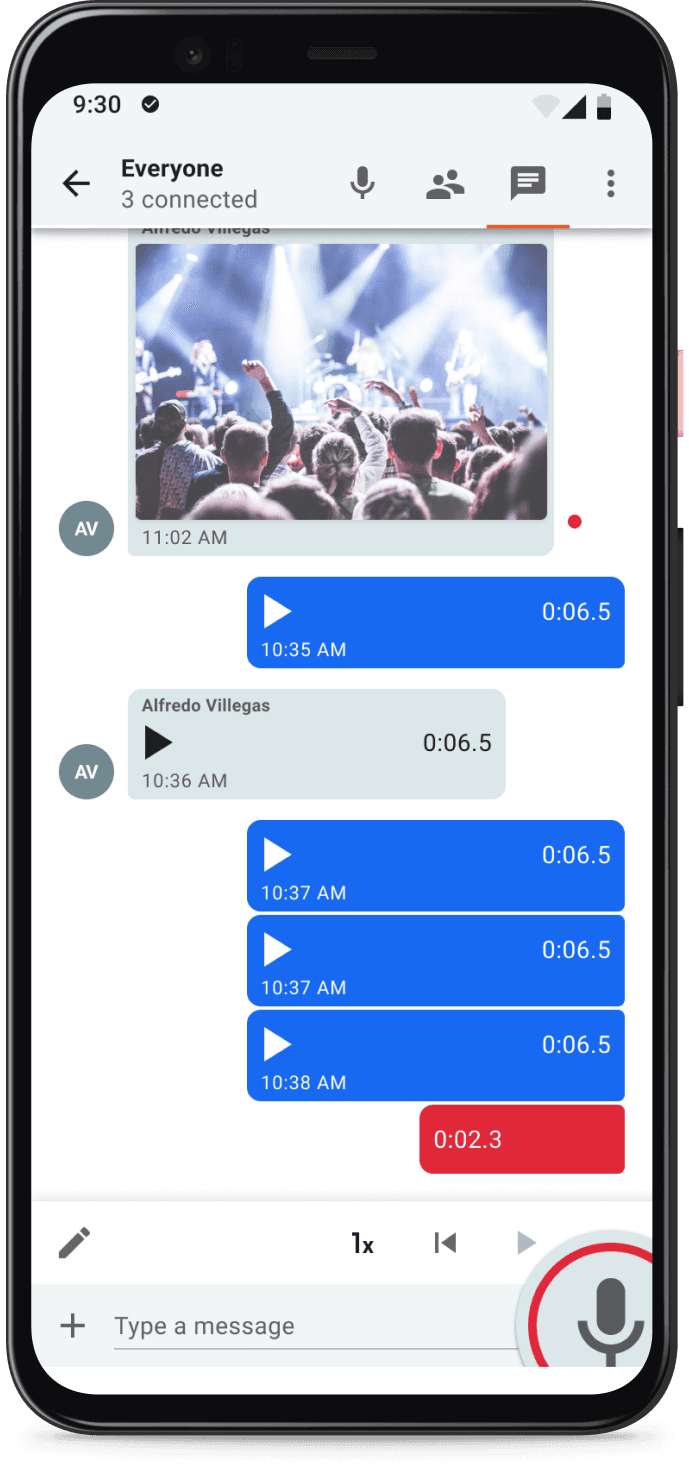
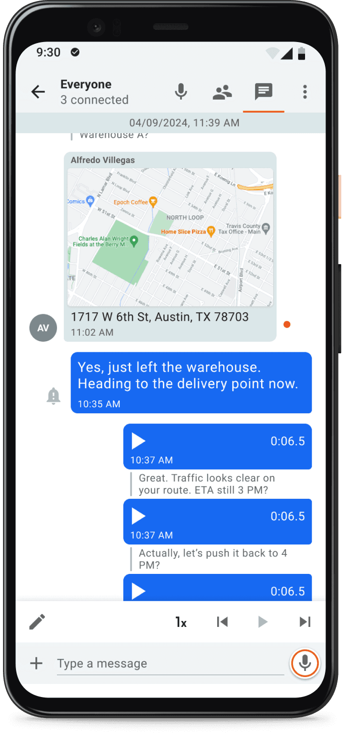
Clearer distinction between audio, text, image, and emergency messages.

Modernized UI created a more seamless experience across Zello platforms.

Multi-select and bulk delete actions became faster and more intuitive.

Suggested improvements

Add waveform previews to audio messages to visualize loudness before playback.

Introduce filters to quickly view specific message types like images or audio.

Improve handling of rare cases like deleted or missing media messages.

Impact

The redesigned Android History screen led to measurable improvements across usability, engineering efficiency, and cross-platform consistency:

The redesigned Android History screen led to measurable improvements across usability, engineering efficiency, and cross-platform consistency:

The redesigned Android History screen led to measurable improvements across usability, engineering efficiency, and cross-platform consistency:

18%

Users identified message types faster during internal walkthroughs.

27%

Engineering effort reduced on related features due to reusable components.

95%

Visual and structural consistency achieved across Android and iOS.

86%

Positive feedback from stakeholders on improved clarity and user experience.
Reflection

Key learnings

Key learnings

Key learnings

Small changes drive big clarity

Even subtle visual improvements, like better message grouping and clearer icons, had a major impact on user speed and confidence.

Even subtle visual improvements, like better message grouping and clearer icons, had a major impact on user speed and confidence.

Engineering collaboration is crucial

Working closely with Android engineers early helped uncover edge cases and avoid costly rework later in the development process.

Working closely with Android engineers early helped uncover edge cases and avoid costly rework later in the development process.

Focus on core value first

Prioritizing the highest-impact usability issues first allowed us to deliver meaningful improvements quickly, even under tight timelines.

Prioritizing the highest-impact usability issues first allowed us to deliver meaningful improvements quickly, even under tight timelines.

Scalability needs early thinking

Designing a flexible message system early on made it easier to plan for future media types and platform expansion.

Designing a flexible message system early on made it easier to plan for future media types and platform expansion.